38 Million Ecobici Trips in Mexico City
This post is very much inspired by Todd Schneider's fantastic work from early 2016: A Tale of Twenty-Two Million Citi Bike Rides: Analyzing the NYC Bike Share System.
I learned a huge amount from studying Todd's work, and it inspired me to attempt a similar analysis for the public bike share system in Mexico City called 'Ecobici'.
Not only was it fascinating to take a detailed look at how the bikes are used on a day-to-day basis, but I was also pleased to be able to learn some new tools and techniques.
Some of my analyses are almost direct replications of Todd's using the Ecobici data, albeit my own implementations using Python rather than R. For these I am incredibly grateful to Todd for making his work so freely available.
I have split the post into the following sections:
- A day in the life of Ecobici
- Data & bike usage overview
- Where are all the female riders?
- Speed estimates
- Magical bike transports
- Data anonymity
- Can you predict trip duration?
1. A day in the life of Ecobici
As soon as I saw Todd's animation for NYC, I knew it was something I wanted to try and replicate, not only because it looks so cool, but also because I think it really gives a sense of the scale of the system.
The approach is very similar, where each blue dot represents a single bike trip as they follow the Google Maps cycling directions between stations.
Obviously you cannot assume that people will necessarily follow that route, and in many cases they are likely to do other things rather than just riding directly from station to station, however it isn't a bad place to start for getting a sense of the patterns among the trips.
The date in question is Wednesday 6th April, which is the 3rd busiest day in the history of Ecobici, chosen because the busiest two days are both in 2015 and I wanted to use a more recent date to take into account roadworks and construction that have happened in the meantime.
In total there were 36,711 trips that day, although in order to try and reduce the amount of data required for the visualization I eliminated all trips starting and ending at the same location, and then specifically focused on trips in the more central and northern part of the city (Roma Sur and upwards, which includes 274 of 452 stations) resulting in a total of 26,271 trips.
Watching the blue dots make their way across the map is pretty mesmerising and you can already see some bright concentrations of bikes, particularly along a main road (called Reforma) cutting diagonally across the top half of the map.
We can go one step further and look at what seem to be the most popular roads by mapping the individual legs of the suggested Google Maps routes, weighted by the number of rides that use that leg.
Most Popular Roads for Ecobici Trips
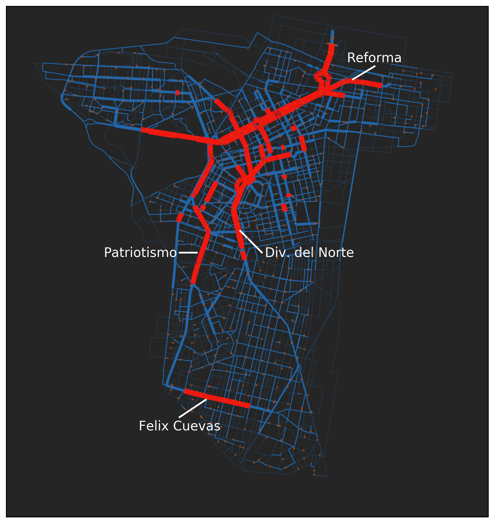
The thick red roads are those that have 500 or more rides along them. The orange dots are the Ecobici stations.
Very clearly marked are big stretches of Reforma, División del Norte and Patriotismo, and also a section of Felix Cuevas down in the south.
It is unsurprising that these would turn up so many times in Google Maps directions as they are all key roads connecting different parts of the city, but also have good coverage with bike lanes.
One thing I found interesting was how the bike trips during a single day are likely to cover almost every street within the Ecobici area. Just by plotting each of these legs, we end up with a pretty complete map of the city!
2. Ecobici Data & Overview
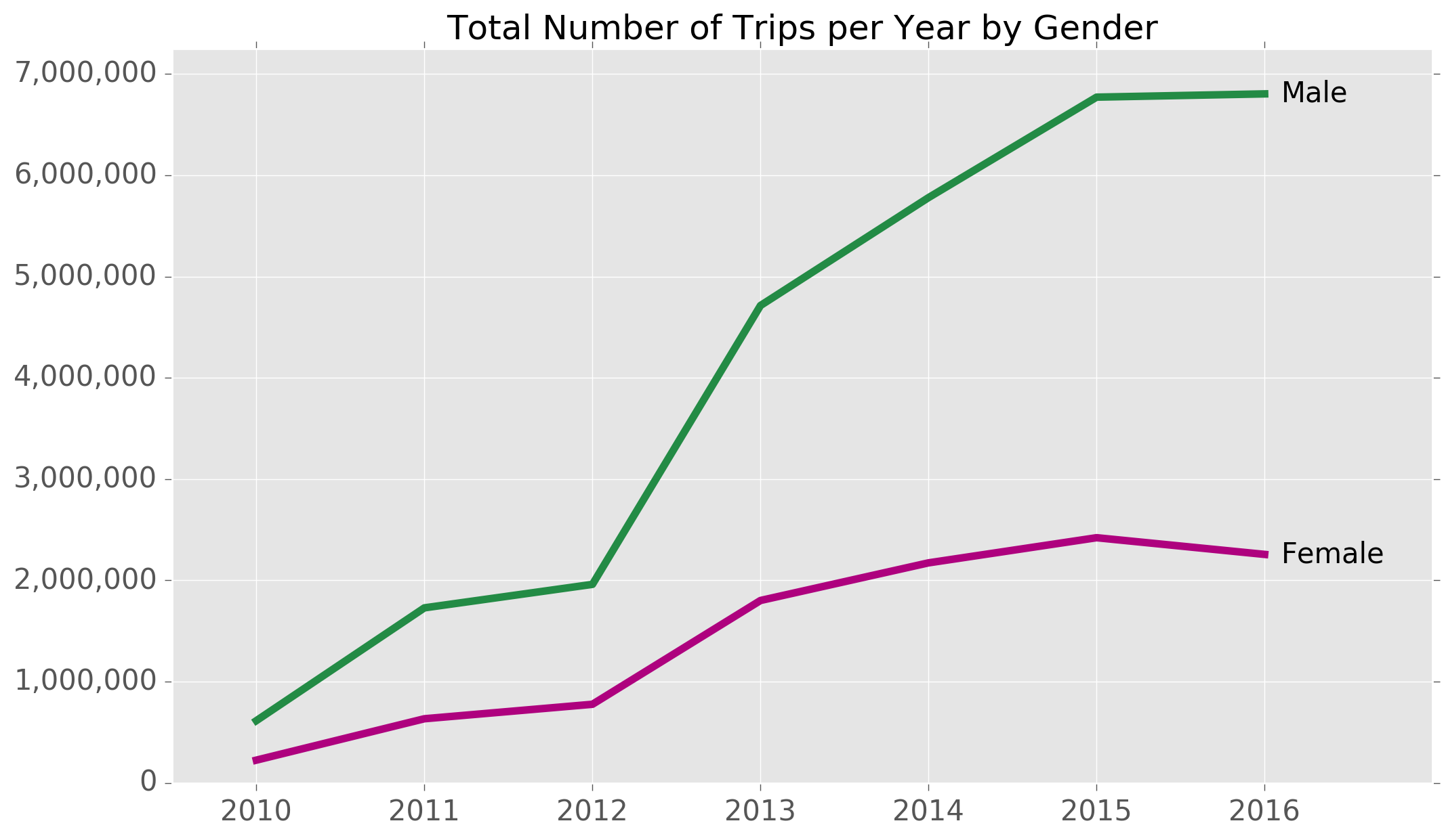
The Ecobici bike share system started in 2010, and since then has grown quite significantly in terms of usage. Here is a chart showing the total number of bike trips per year:
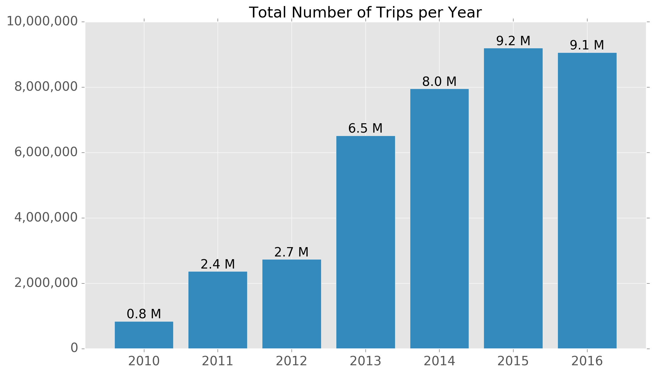
The inflection point seems to have been around 2013 when bike usage exploded with nearly two-and-a-half times as many bike rides as the previous year. So far, 2015 has seen the highest levels of usage.
The number of bikes in circulation has also increased steadily, with large numbers of new bikes being added every couple of years or so.
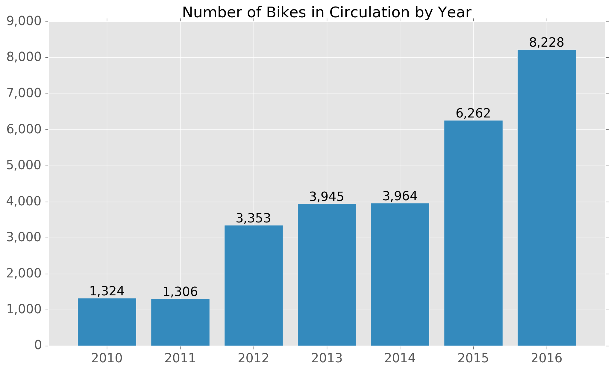
Interestingly, an additional ~2,000 bikes were added in 2016, even as the overall number of rides remained flat.
With yearly growth of at least 15% between 2013 and 2015, it may be the case that the Ecobici operator was provisioning for similar growth in 2016 that did not materialize.
Alternatively, it could be that there were bike shortages in 2015 and hence the new additions were simply to 'catch-up' with demand.
Ecobici scale
The Ecobici system works similarly to ride-shares in other countries with fixed locations across the city where you can pick-up and drop-off bikes. As of today, there are a total of 452 bike stations across the city covering an area of approximately 55 sq km.
The system operates Monday - Sunday from 5AM to 12.30AM every day of the year, although there is often reduced service on certain public holidays.
By the end of December 2016 there had been a total of 38,661,411 trips using Ecobicis.
The Data
Monthly data is available for Ecobicis, including the following information for each individual ride:
- Trip start date and start time
- Trip end date and end time
- Pickup station
- Drop-off station
- User gender
- User age in years
- Unique bike identifier
Here is what the number of monthly rides looks like between January 2013 and December 2016:
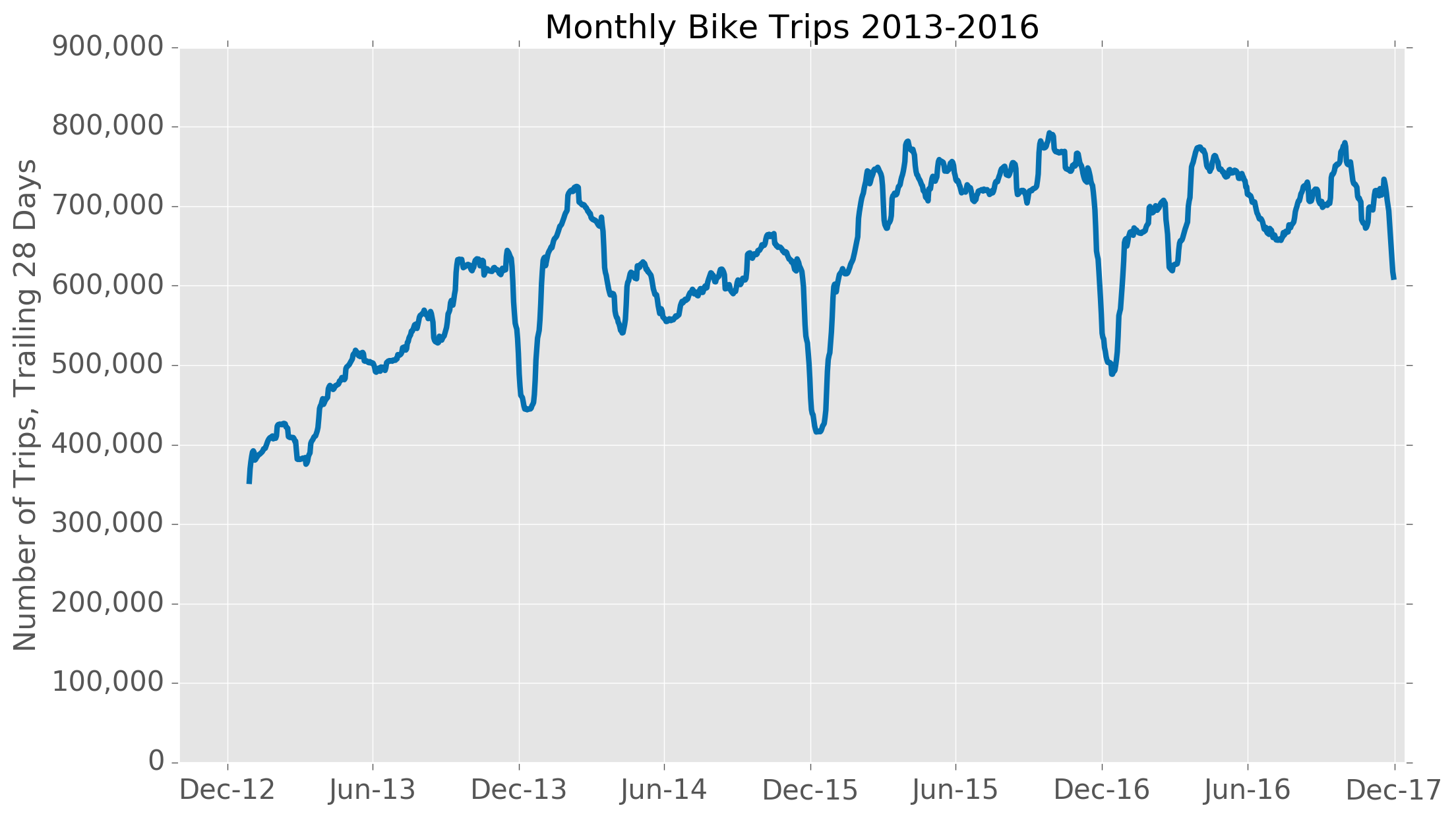
You can see that usage falls most heavily around December each year...likely because of the Christmas holidays. There are also smaller drop-offs in rides around June which coincide with the middle of the rainy season.
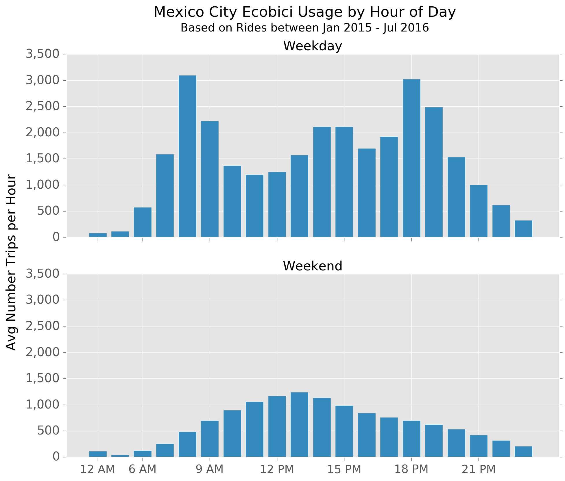
Average Usage
The number of bike rides is much higher during the week than at weekends, and usage patterns also vary during the day.
On weekdays, there are clear peaks around 8 AM and 6 PM, very likely representing morning and afternoon commuters. There is also an increase in activity between 2 and 3 PM which coincides with lunchtime for the typical office-worker.
On the weekends, the ramp-up is more gradual, and most activity seems to occur between late morning and early evening.
3. Where are all the female riders?
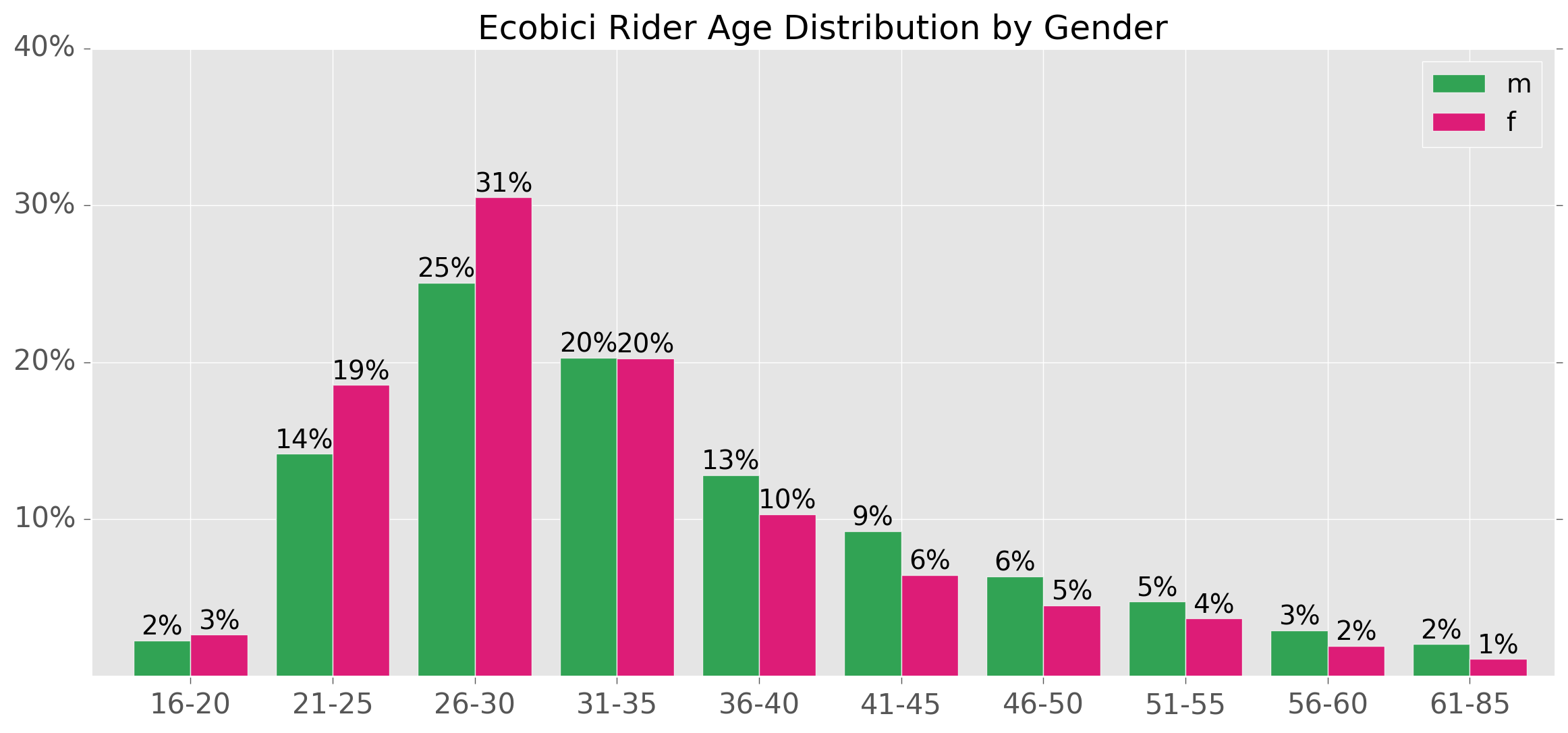
Women use Ecobicis far less than men, and the gap has been widening:
Furthermore, female riders tend to be younger, with 73% aged 35 or below, vs. only 61% for males riders.
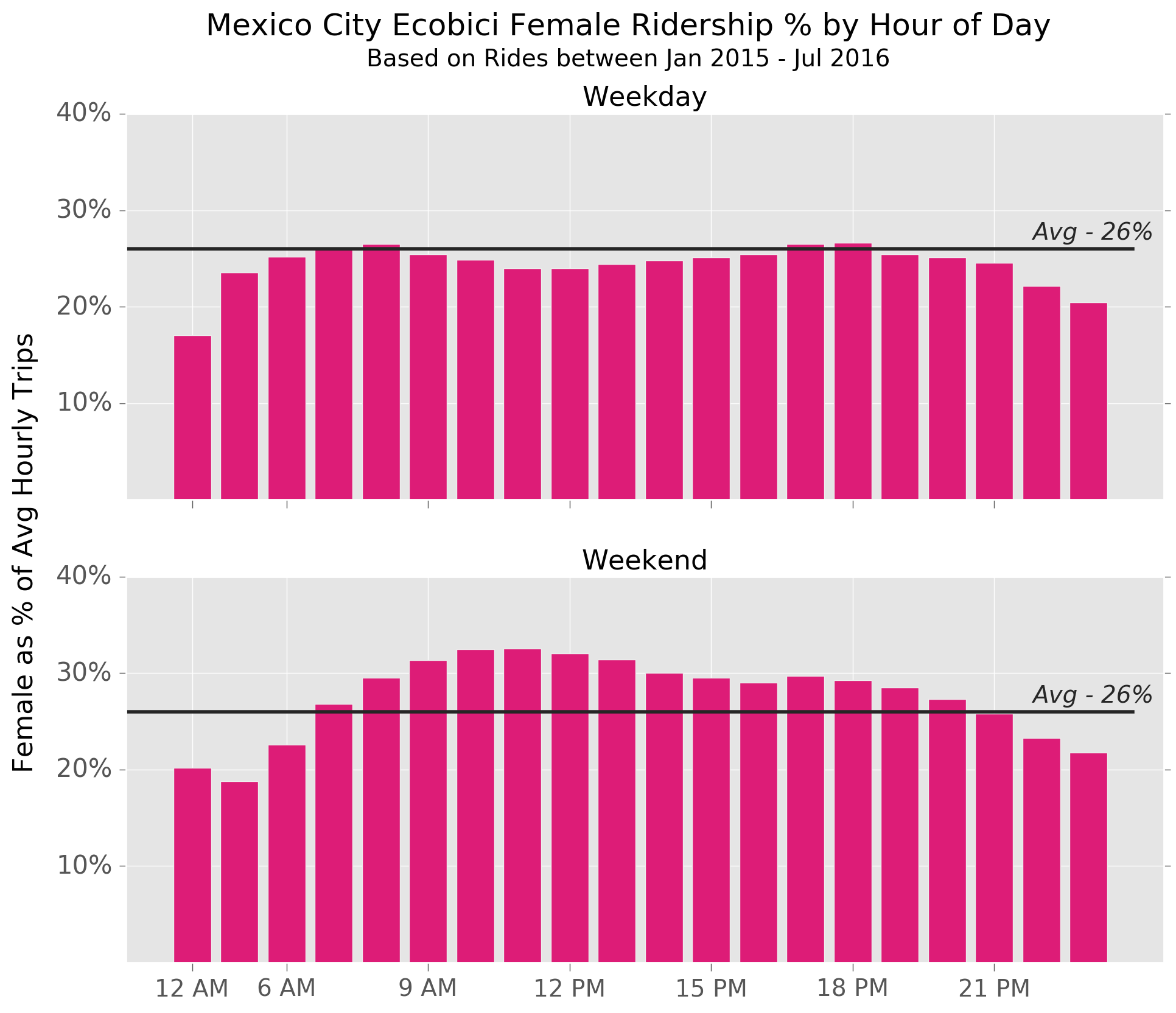
On average, female riders accounted for 26% of all trips between January 2015 and July 2016.
We can get an idea of female usage patterns during the day by comparing the proportion of rides initiated by women to this percentage, as per the charts below.
You can see that women are more likely to use Ecobicis at weekends, particularly during daytime hours, and less likely to take rides late at night or very early in the morning.
We can also look at how female Ecobici usage varies by region of the city. One possible approach is to look at the percentage of rides starting at different stations by gender, however the problem with this is that in many areas stations are very close together so it can be hard to easily distinguish patterns.
Another option could be to group the stations by colonia (neighborhood), and look at the gender distribution for each grouping, however there are a number of quite large colonias within the ecobici coverage, and so this view does not capture all of the underlying detail.
In the end I decided to use hexagonal bins spread across the city, grouping Ecobici stations by hexagon. Each hexagon has a width of about 800m and covers an area of approximately 0.4 square km, resulting in a total of 112 of hexagons covering the parts of the city with Ecobici stations. The median number of stations per hexagon is 4.
Below is a map showing the percentage of rides started by females within each hexagonal bin:
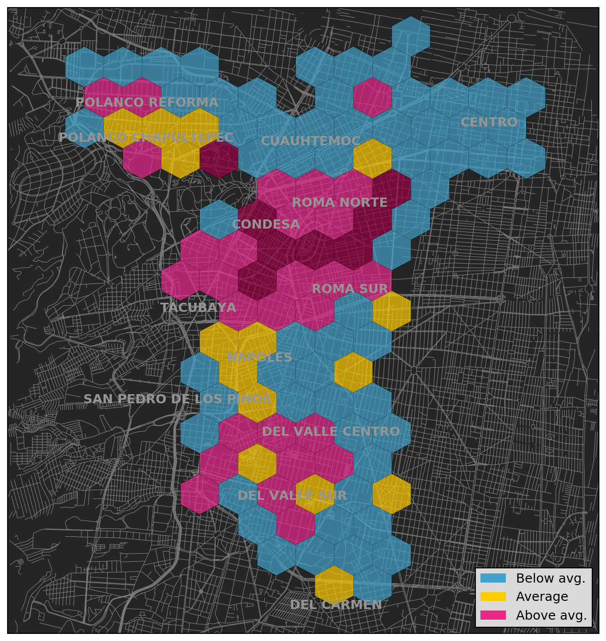
You can see that female usage seems to be particularly concentrated around the Colonia Roma and Condesa areas, and lower than average in and around the Center and Colonia Cuauhtemoc.
4. Speed Estimates
I will not to into a lot of detail about trip speeds, however it is interesting to briefly look at how speed may vary by age and gender.
Although speed is not included in the raw data, we can make some estimates using the trip start and stop time, along with the obtained Google cycling directions.
Below are charts plotting the estimated average speed by gender and age for both weekdays and weekends.
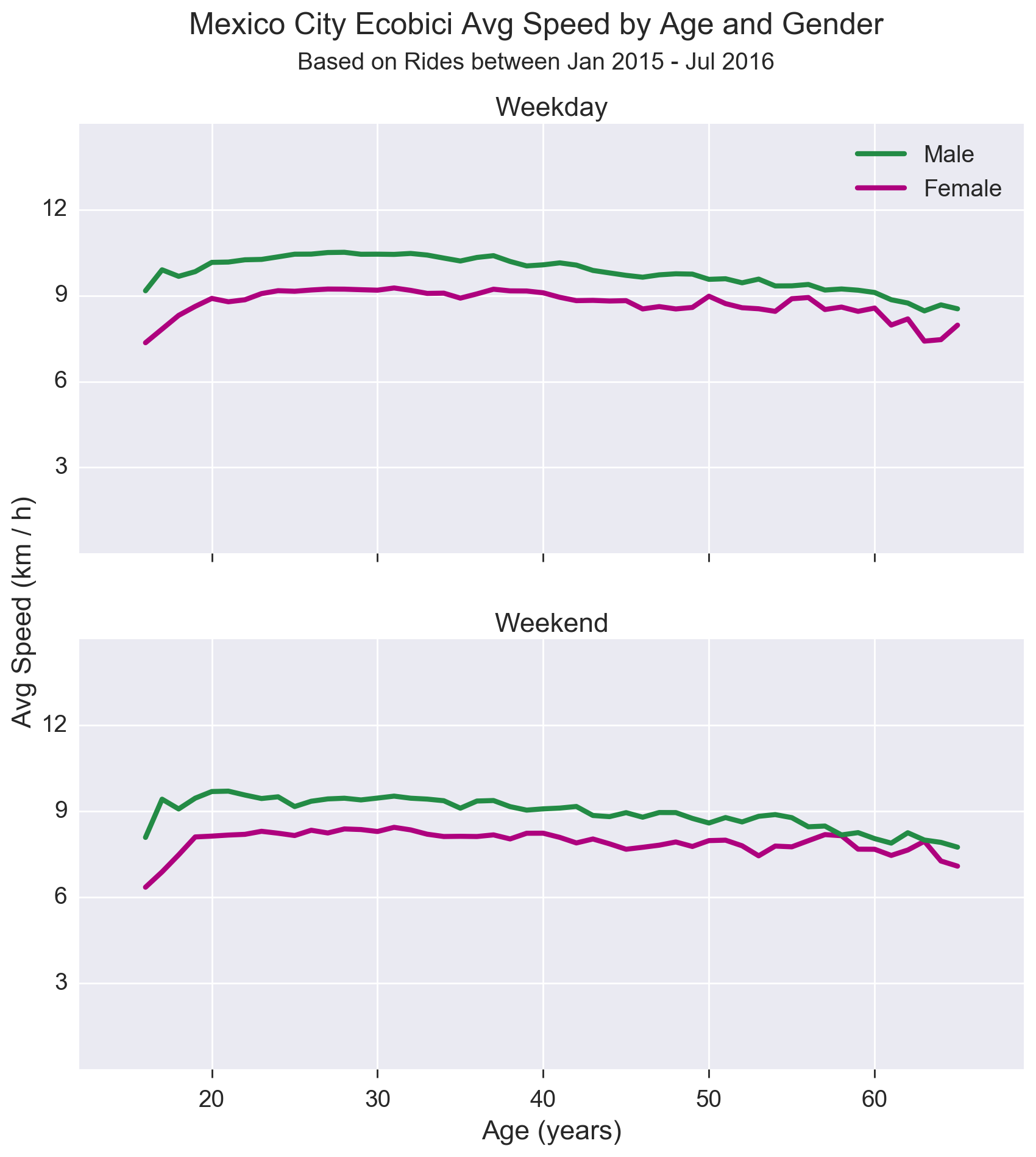
Note that in the analyses for these graphs I ignore all trips less than 60 seconds in total, and restrict the rider age to 65 or under.
The first thing we can see is that it looks like male riders are, on average, consistently faster than female riders, and that in both sexes, younger riders are faster than older ones (both fairly unsurprising findings).
We can also see that rides taken on weekends are a more leisurely affair, with avg speeds approximately 1-2 km per hour lower across the board.
Obviously this assumes both that the rider follows the routes suggested by Google as well as that they do not make stop-offs along the way.
5. Magical Transports
When running a service like Ecobici, one interesting logistical question is how to manage bicycle supply and demand at each station. Inevitably, once users have taken rides, not all bikes will end up in ideal locations, and it may be necessary for the operator to transport bikes between stations in order to balance out supply.
We can look at how this works in some detail by analyzing bike rides which start at a different station from the one where they were previously dropped off. Todd calls these 'magical transports'.
Here is a chart of magical transports as a percentage of overall rides by month:
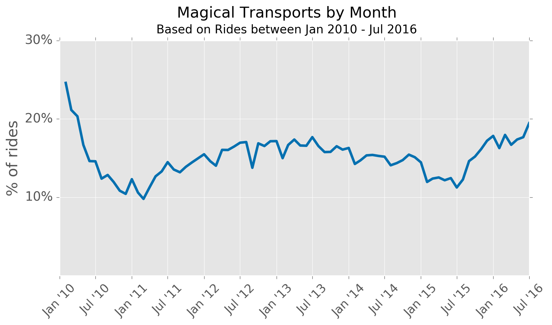
Between 2012 and 2014, the proportion was fairly steady around 16 or 17%, and then fell sharply in 2015 perhaps because the number of bikes nearly doubled (unfortunately I don't have data on when different stations came into operation, or whether their capacity may have changed over time).
Curiously, the percentage of magical transports has been creeping up again in 2016, even as the number of bikes in the system has continued to increase.
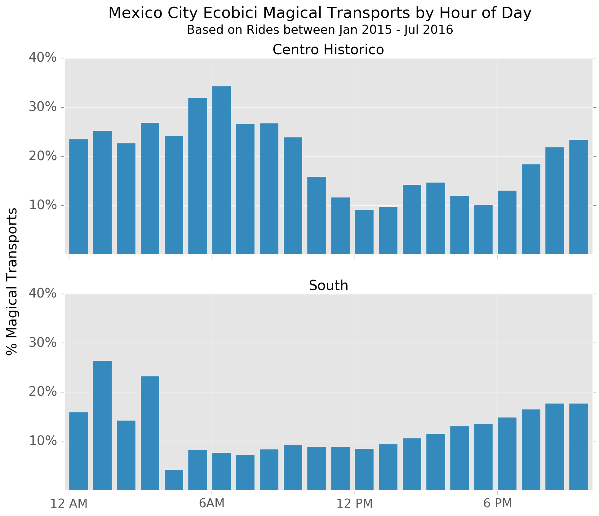
We can also look at which regions of the city seem to have a higher proportion of magical transports, based on the station where the trip ends:
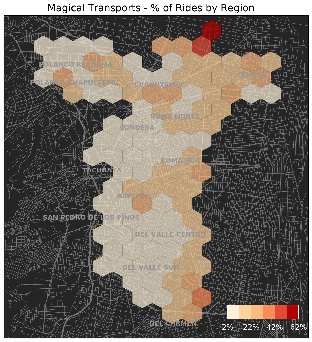
There are specific hotspots around the Center and Polanco and it also looks like rides that end along the eastern-side of the Ecobici zone seem to result in higher levels of magical transports.
The need for moving bikes from one place to another has different patterns throughout the day depending on where the trip ends. For instance, looking at rides ending in the Historic Center and south of the city, you can see that in the south magical transports are quite concentrated in the early hours of the morning, whereas in the Center the higher levels extend much further into the day.
Finally, we can also look at approximately how far bikes are transported between rides:
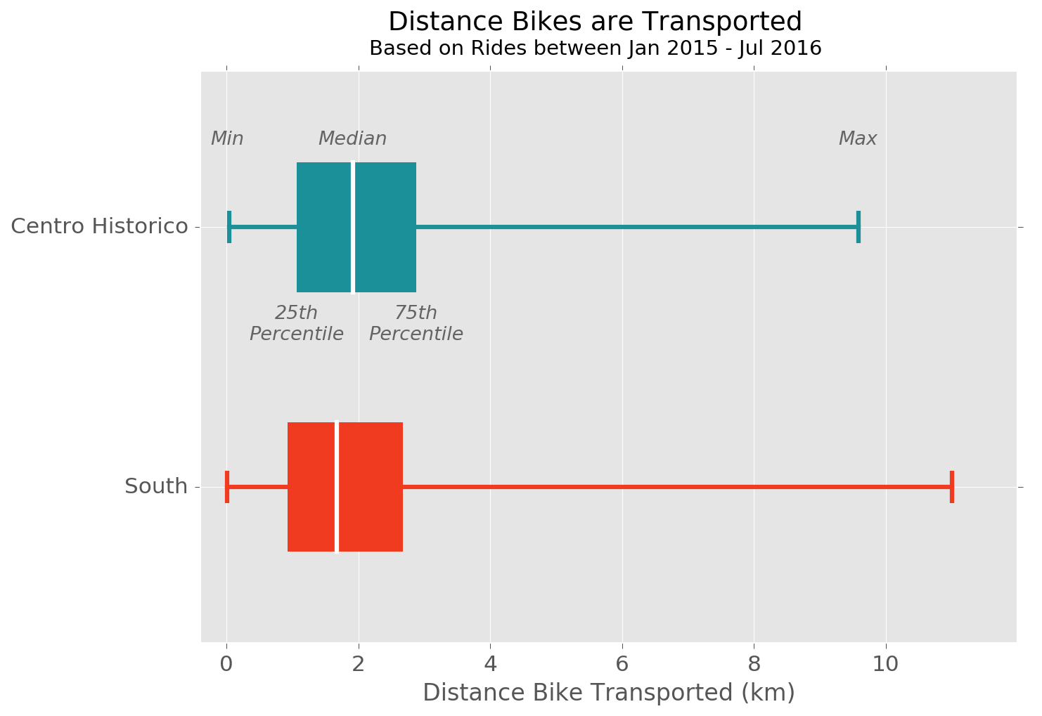
It seems that the majority of magical transports are somewhere between 1 and 3 km, although there are outliers of bikes being moved almost across the whole Ecobici zone.
There is one thing that I should note about magical transports which is that there could be other reasons for bikes turning up at a different location from where they are dropped off, and it will not always be due to reblalancing of capacity.
For example, if a bike is removed from circulation for maintenance or repairs (estimated to be approximately 1% of bicycles on any given day), it is certainly not guaranteed that it will be returned to the original station from where it was taken.
6. Data Anonymity
Another thing that Todd looks at for NYC Citibikes is data anonymity as measured by the proportion of uniquely identifiable trips.
In this case, when we talk about 'anonymity', we are not talking about the presence of names or other such identifiers in the data, but instead the concept that anonymity comes from being part of a crowd.
What this means in practice is that if there are many trips which share the exact same characteristics, then even if you happen to identify one of the users, it will be hard to obtain further information about their particular ride.
However, for 'unique' trips, you can easily obtain complete ride information including things like drop-off location which could tell you something about where people live, work etc.
It turns out that with just a few variables:
- Rider age
- Rider sex
- Start station ID
- Start time
a large proportion of trips are uniquely identifiable.
For instance, on the 1st of January 2016, there was only one ride starting at 8AM with a Fermale rider aged 34 who started from station number 182.
Below is a plot of the percentage of uniquely identifiable rides by gender and age:
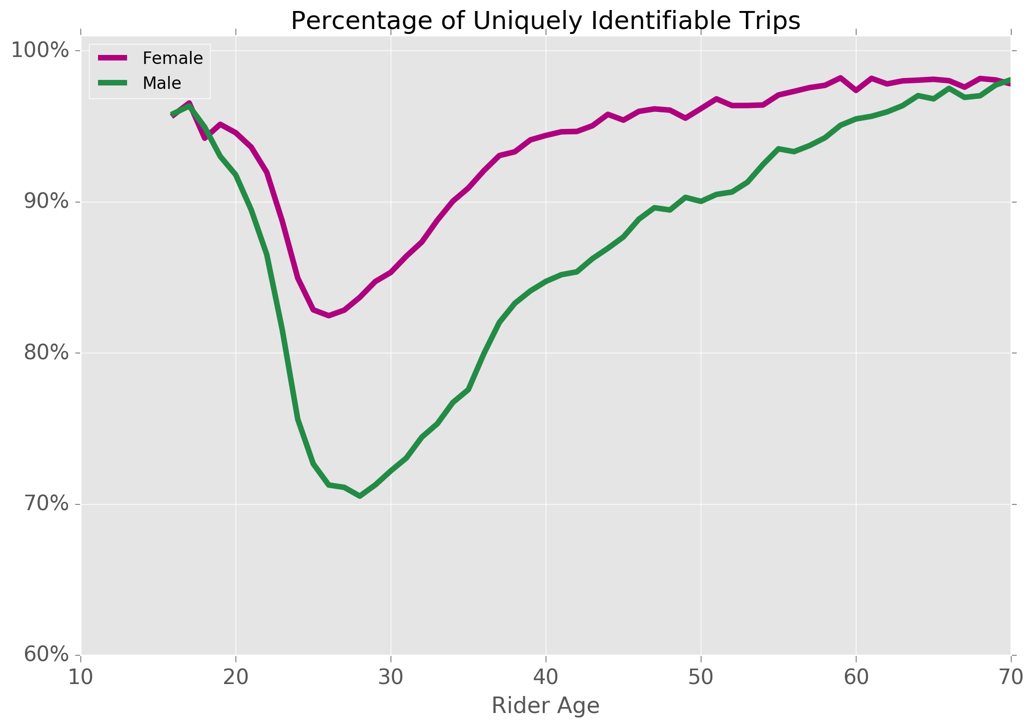
As expected, the proportion is higher for women (there are fewer female riders overall), and also higher for older riders (the distribution of user age is flatter as age increases).
7. Can you predict trip duration?
As a final question, I wondered whether it is possible to predict the duration of a particular bike ride given the available data.
From an operational perspective this could be very useful in order to help with capacity planning and to manage bike availability throughout the network.
Recall that the available data are:
- Gender
- Age in years
- Start / end time & date
- Start location and end location
although it isn't appropriate to include any information about the ride end time or location as the aim is to predict the duration in advance.
Although trip duration is not explicitly given, we can easily calculate this using the timestamps for the trip start and end time.
Linear Regression
Given what we know about estimated trip speed varying both by age and gender, a very simple approach could be to look at this as a regression problem using these two variables.
To get an idea of how successful this could by, I plotted trip duration vs. rider age for a random sample of 10,000 rides:
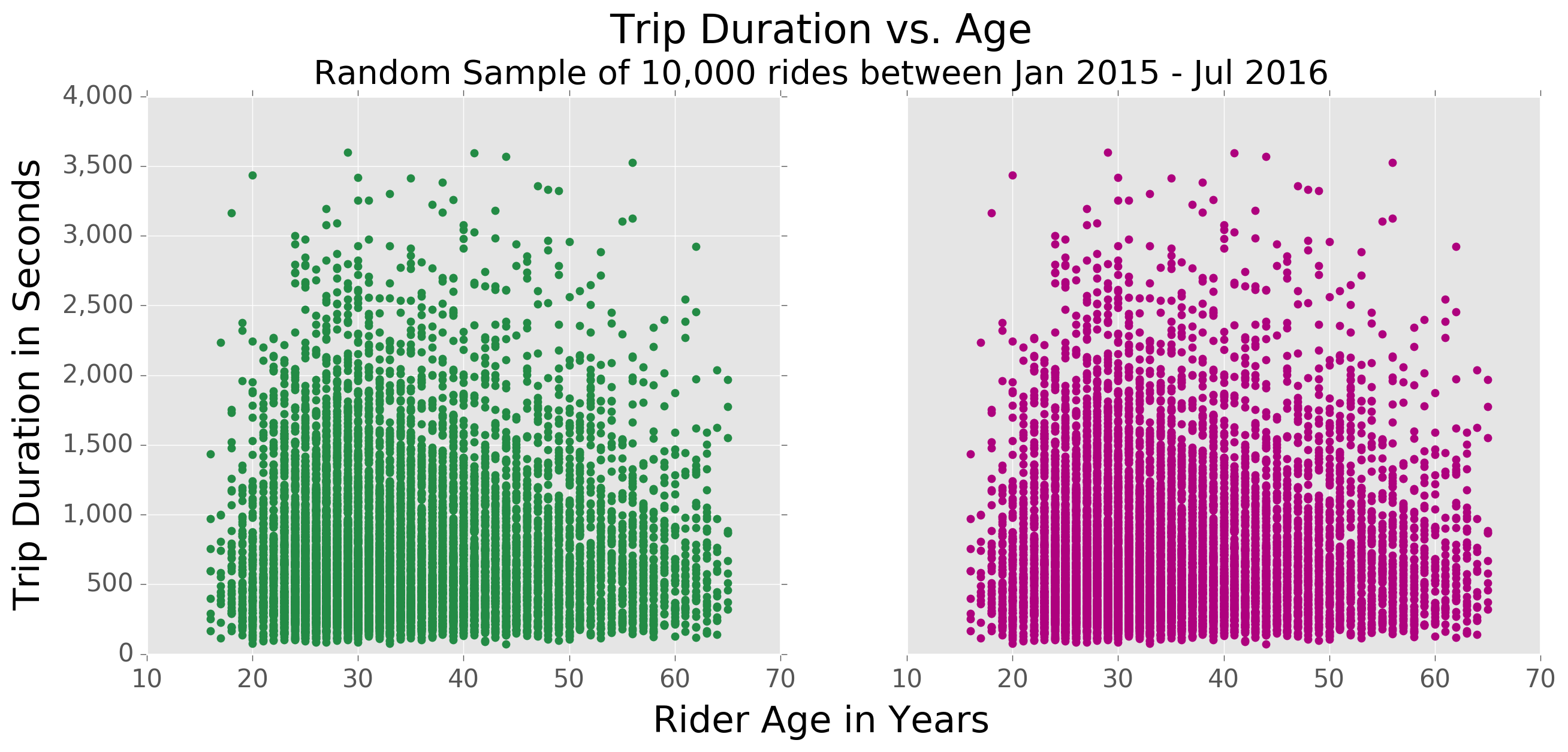
Not only is there clearly no linear relationship, in fact you can see that at each age there is a very large range of trip durations.
As a next step, we could try and add in additional features to look at trip durations for much more specific subsets of the rides. For example, below is the distribution of ride durations for 25-year-old female users departing from 3 stations close together in Polanco on weekdays at 9AM:
Even for this very specific subset, there is still a wide range of trip-durations and so, on the face of it, it looks like it would be hard to build an accurate model with the available data.
Classification in buckets
Even if we treat this as a classification problem, it still seems that it would be hard to build a sufficiently accurate model.
For instance, taking the example from above and using intervals of 10 minutes, there are at least three possible classes but no further variables that could help in differentiating between them.
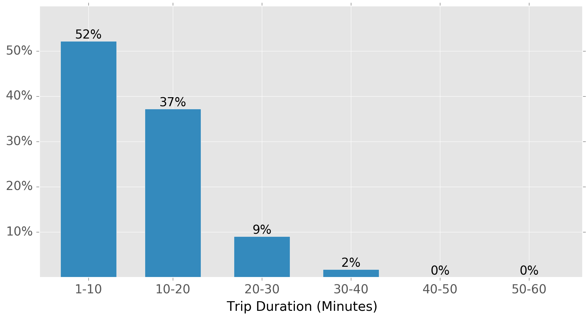
If we use smaller intervals, of say 5 minutes, then the problem will be even worse, and using longer timeframes of 20 or 30 minutes is just not that useful as we already know that the vast majority of rides last less than half an hour.
To demonstrate this I tried training a large Random Forest (1000 estimators) on a random sample of 1,000,000 rides using approximately 120 features consisting of:
- Gender
- Age
- Weekday vs Weekend indicator
- Starting hour
- Month
- Start station location (grouped by hexagonal bin)
The best result I was able to obtain, even after some parameter optimisation using cross-validation, was an accuracy of less than 50%.
Ultimately it may be possible to obtain a slight improvement in accuracy, either with additional optimisation or using a model capable of capturing additional complexity, however I don't think that the available data is sufficient to be able to construct a useful predictor.
If on the other hand you had access to individual ride history, then it would likely be possible to build a far more accurate model for specific users.
Conclusion
When I started this mini-project, I thought it would be relatively easy to throw something together similar to Todd's NYC analysis given that I had all of his code to study.
In the end it took a lot longer than I expected, partly because I had to learn some new tools and techniques (e.g., POSTGIS and geographic queries), but also because I found it so easy to lose myself in exploring the data and looking for other interesting stories to tell.
Even now I feel like I have barely scratched the surface of the dataset, and there are a lot more things I would like to explore.
In particular, it would be interesting to look at the temporal distribution of rides starting from individual stations, that is to ask what is the probability that a bike (or more) will be taken from a particular station within a given timeframe.
One of the elements I particularly enjoyed while writing this post was getting more into mapping. There was this one particular moment when I was plotting the various Google Maps directions on a blank canvas for the first time, and low and behold an almost complete map of the city appeared along with easily identifiable roads, roundabouts, parks etc.
I thought that was pretty cool!
As usual, my accompanying code (should anyone else find it useful) is on my GitHub.