Visualizing Pollution in Mexico City
Mexico City, where I currently live, is well-known for its poor air quality and high levels of pollution.
As for any very large city, one of the key challenges is the sheer number of cars on the road. Indeed one recent report indicates that there are now more than 5.5 million vehicles in daily circulation within the metropolitan area, with 250,000 new vehicles added anually.
One of the measures that has been taken by the authorities, introduced in 1989, tries to reduce both traffic as well as associated pollution through a program called 'Hoy No Circula' (literally 'Does Not Circulate Today') whereby vehicles are prohibited from public circulation on a revolving basis dependent on the last digit of their license plates.
In practice, the digits are grouped into pairs so that on one day cars with license plates ending in 1 & 2 are prohibited, on another day 3 & 4 and so on.
The main thing that dictates whether or not your vehicle is subject to the Hoy No Circula regulations is the outcome of mandatory emissions testing which must be carried out twice a year. Based on the test results, you are given a 'hologram' designation of 0, 1 or 2 (so called because after every test a holographic sticker is fixed to the inside of your windscreen), and cars obtaining a '0' are exempt from the program.
(Brand new cars start out with an automatic '00' rating which is also exempt from Hoy No Circula, and additionally these cars do not require emissions-testing for the first 2 years of their life)
Ever since moving to Mexico in 2008, I have been lucky enough to be relatively unaffacted by these restictions, aside from the twice-yearly nightmare of trying to get my car tested (a story best kept for a different day).
However, in March of this year, the authorities announced that there would be extraordinary measures taken due to particularly bad and dangerous pollution levels whereby all cars, indpendent of their hologram, would by subject to the Hoy No Circula program for one day a week and one saturday every month.
At first it was slightly irritating to have to get used to the rules, however necessary they were, but in the end I think many people were surprised at how quickly they adapted.
More relevantly I also got to thinking about some of the underlying questions such as how bad pollution was to warrant these emergency measures, and whether or not the additional restrictions had any impact?
Recently I have been wanting to practice techniques in Data Visualization, such as experimenting with different types of charts and story-telling with data, and this seemed like a perfect opportunity.
Fortunately Mexico has made some quite impressive advances in recent years with regards to open data, at least in certain areas, and so it was pretty easy to get hold of some data to play with.
Before going any further a quick disclaimer: this is merely an exercise in data visualization and I certainly don't claim to be evaluating the effectiveness of these measures in any scientific way.
How many cars?
A good place to start seems to be looking at the number of vehicles on the road, and how this has evolved over time. For this I was able to obtain data from the National Statistics Office on the number of registered vehicles in each federal entity.
On the chart below I plot the total number registered vehicles in the area comprising the metropolitan zone of the valley of mexico, split by vehicle type:
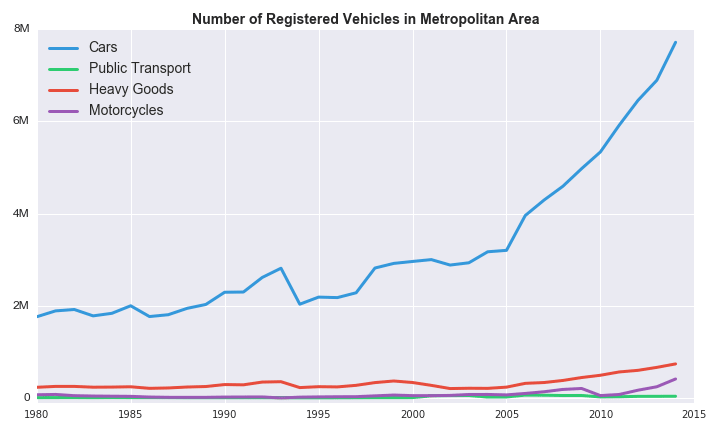
As expected, cars are the most common type of registered vehicle, and the number has grown four-fold since 1980 to nearly 8 million in 2014. It is also telling how growth in cars has accelerated in the past 10 years.
Between 1980 and 2005, the number of registered cars grew about 2.4% annually but between 2005 and 2014, annual growth was 10.2%!
To put it another way, on average 100,000 cars were added every year between 1980 and 2005, compared to 300,000 new cars per year in the last 9 years.
From the graph above it is hard to see what is going on with public transport, so below is a plot of the category on its own:
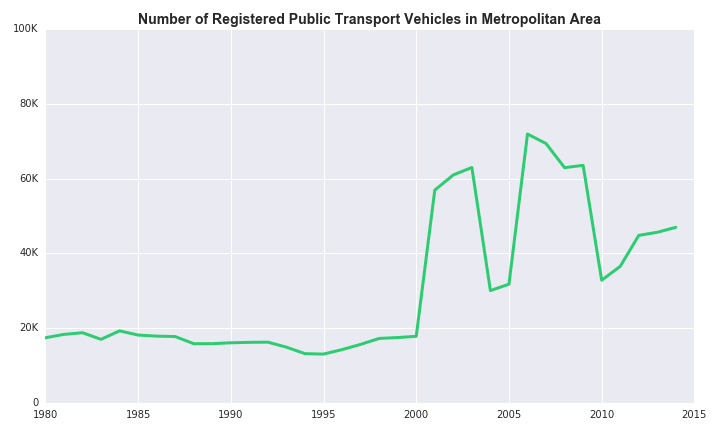
The number of public transport vehicles has also grown, more than doubling from just under 20,000 in 1980 to around 46,000 in 2014.
Clearly there is something strange going on between 2000 and 2010, but if we take the data at face value, it is clear that public transport growth has lagged behind that of private vehicles, and since 2005 has grown at only 4% per year.
There are many other interesting questions that could be explored for how transport has changed over the years, however this post is meant to be about pollution, so I will move on for the time being.
Suffice it to say that the data backs up the report I mentioned earlier, and cars are clearly a big and growing problem for the city.
A Baseline for Pollution
The body responsible for measuring pollution in Mexico City is part of the Environment Agency and conveniently they make all of their data readily available on their website.
In general there are many different metrics used for measuring air quality, but in the end I decided to focus on the Ozone levels as there was a lot of emphasis placed on these during the environmental 'contingency' earlier this year.
The first step is to get some sort of a baseline for the pollution levels prior to 2016. Here is a plot of the daily average Ozone levels across the city in 2015:
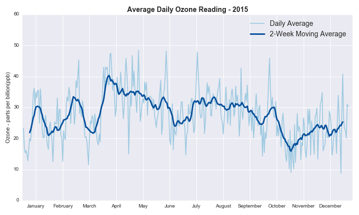
The daily data is pretty noisy, but you can still see some evidence of seasonality with October through December being, on average, slightly lower months and April and May slightly higher.
However this is just the average reading which is quite heavily influenced by lower measurements at nighttime, and so to get a better sense of the overall picture, here is the daily maximum on the same axes:
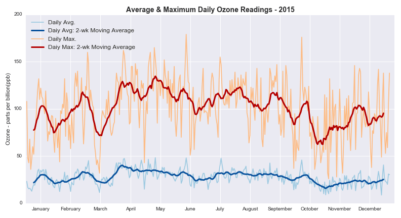
As with the average, the maximum Ozone measurements display a slight seasonal trend, and you can also see a pretty large gap between the average and maximum readings.
The next question I looked at was how pollution levels behave throughout the course of a day:
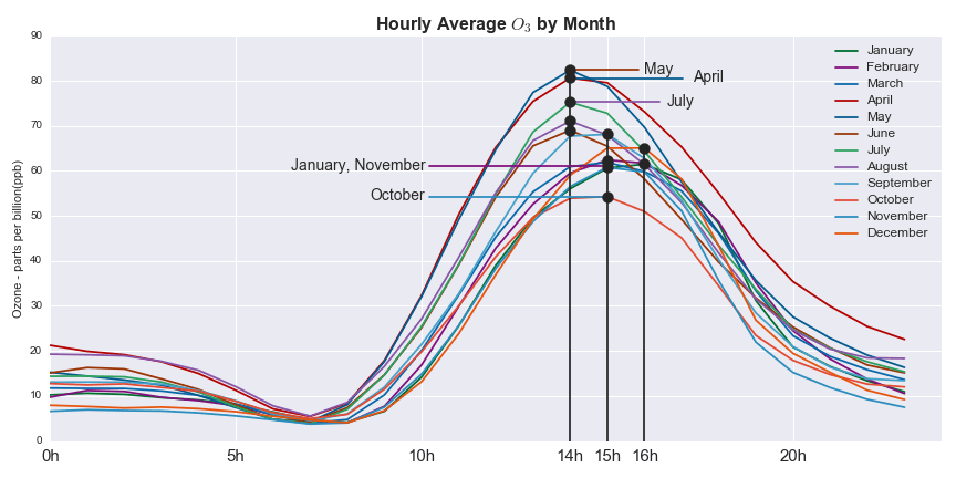
Although there is quite a lot going on in this picture, I think there are a couple of interesting takeways:
- The overall pattern throughout the course of a day is similar year-round, and not that unexpected, with low Ozone levels early in the morning / late at night and higher levels during the daytime
- One interesting difference between months is that the Ozone levels seem to reach their peak at slightly different times of the day:
- April - August: 2pm
- February, March & September - November: 3pm
- January, December: 4pm
So why the additional restrictions?
Given that the decision to take the emergency measures was made in March, it seems natural to think that pollution levels must have been a lot worse during the first few months of this year compared to previous years.
To look into this I compared the Ozone measurements for January - March 2015 and 2016 from a number of perspectives
The first perspective involves looking at average readings from across the city.
In practice, the agency responsible for pollution monitoring has a number of measuring stations placed across the city. In my analysis I only included those stations that were in use in both 2015 and 2016, resulting in a total of 33 stations.
Here is a chart that looks at how the average reading for each station changed from 2015 to 2016:
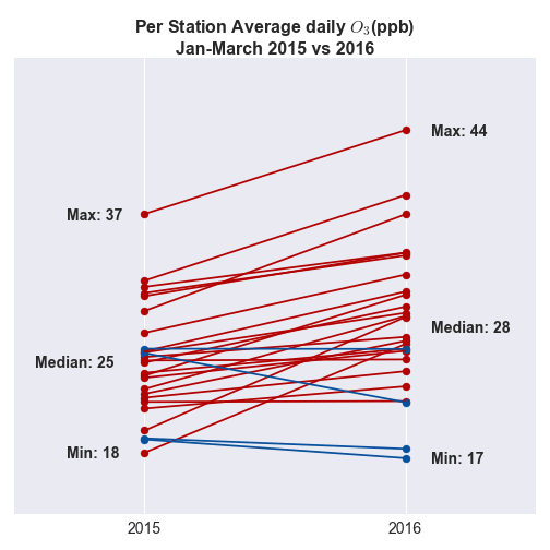
It is immediately clear that for all but 4 of the measuring stations, the first quarter readings were worse on average in 2016 compared to 2015.
However, once again these are averages that are heavily influenced by large portions of the day where the readings are low, and furthermore do not take into account any measure of good or bad readings.
Along with the raw data, the Environment Agency also publishes a scale of what constitutes a good or bad reading, and for Ozone the scale looks like this:
| Category | Ozone (ppb |
|---|---|
| Good | 0 - 70 |
| Regular | 71 - 95 |
| Bad | 96 -154 |
| Very Bad | 155 - 204 |
| Extremely Bad | > 204 |
Using these categories, another way to compare 2015 and 2016 could be to look at the number of days where the maximum measurement across the city was outside acceptable limits.
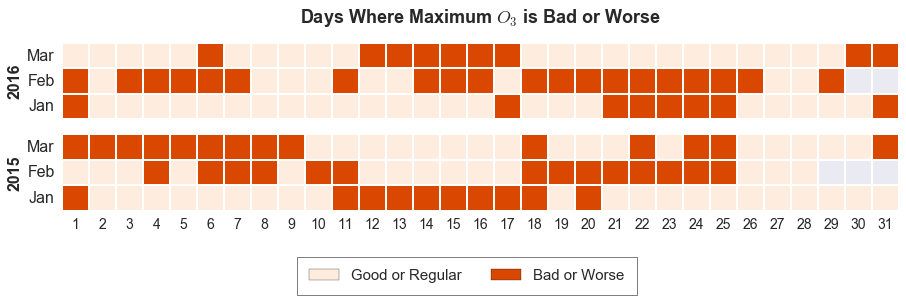
On the face of it, 2016 doesn't seem much worse than 2015. How about instead looking at the number of times per day that readings are bad or worse based on all measurements across the city?
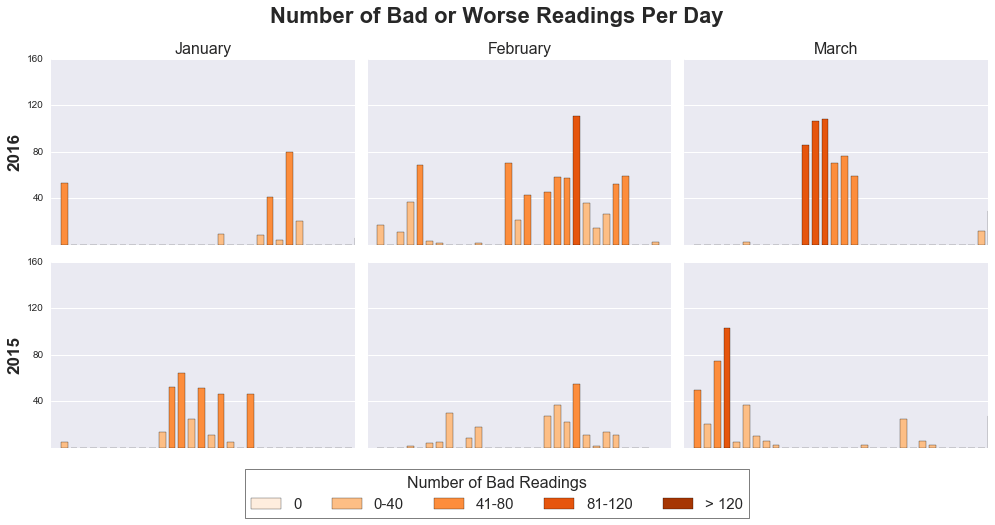
From this chart it is clearer that there were more dangerous Ozone readings in 2016 compared to 2015: the bars are generally both darker and taller.
In fact, in March there were three days in a row with more than 80 bad or worse Ozone measurements across the city.
What Happened During the Contingency?
As I mentioned earlier, the additional measures required all cars to participate in the Hoy No Circula program, independent of their hologram.
However during the contingency on some days the pollution levels were judged to be so bad that the restrictions were effectively doubled for those days, that is to say that four rather than just two license plate digits were included.
The first thing to look at is the number of restrictions per day during the contingency period.
Here the data comes from a website (www.hoy-no-circula.com.mx) which provides daily information on the driving restrictions. I used a web scraper to go through all of the days from the first 6 months of this year and extract information on those days where restrictions applied to cars with Hologram 0 or 00.
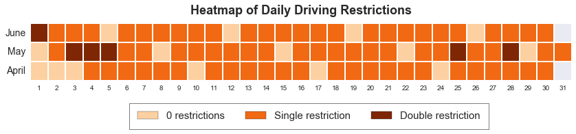
You can see that the additional restrictions started on the 4th of April, with breaks only on Sundays until the end of June. In total there were 6 days of double restrictions.
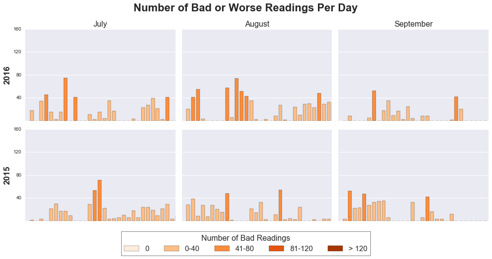
The next thing I looked at is whether Ozone levels were any better or worse in 2016 compared to 2015 during this contingency period.
I used the same types of graphics as in the section above looking at the first 3 months of the year.
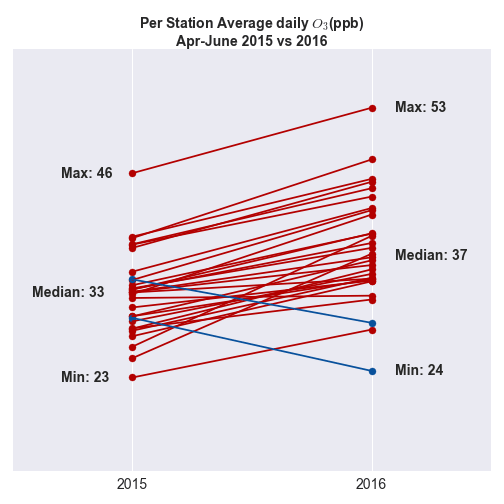
Looking at the station averages, the picture is worse than for Jan-March, with all but two measuring stations registering an average reading worse in 2016 than 2015.
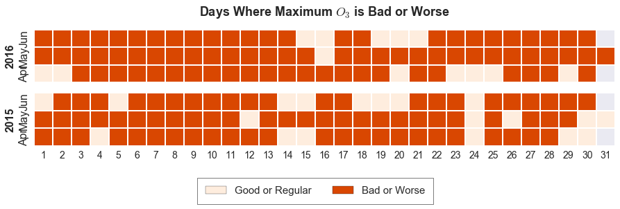
Here both 2015 and 2016 look pretty bad, and there is not much between them.
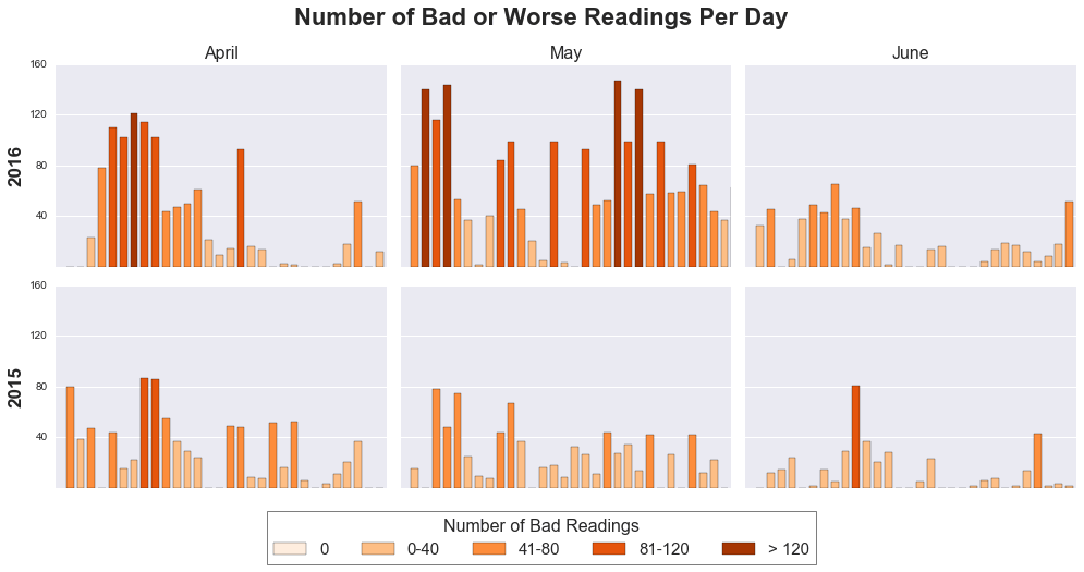
This is probably the most persuasive picture and you can see quite clearly that there were many more bad or worse readings across Mexico City in 2016 compared to 2015, particularly in April and May.
What about the weather?
Pollution levels are about more than just cars on the road, and it is well known that weather behaviour has a strong influence too.
I did not go into much detail here, however the Environmental Agency does publish weather measurements taken across the city, and I wanted to at least look at the relationship between some weather variables and Ozone levels.
Below are scatter plots looking at how Ozone readings vary with Pressure, Relative Humidity, Temperature and Wind Speed.
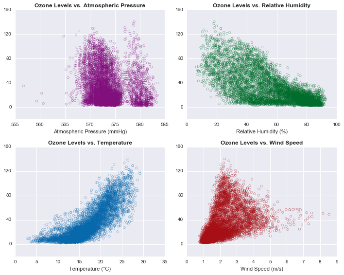
The relationships between these weather variables and Ozone readings are clearly complex, although lower Ozone levels seem to be associated with lower temperatures and higher relative humidity.
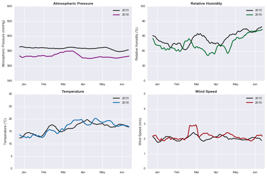
I also looked at the behaviour of these weather variables in the first half of 2015 and 2016. Most notably, 2016 seems to have exhibited lower atmospheric pressure than 2015, and also slightly lower relative humidity, particularly between March and June
2016 Year-to-date
The 'contingency' ended on the 30th of June, and as of writing we are now just two months away from the end of the year. So how has the year been as whole vs. 2015, and what have the past few months looked like in terms of Ozone levels?
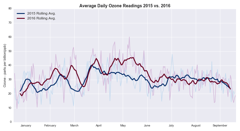
The average levels were noticably higher in 2016 during the first half of the year, particularly between April and June, but since then, the levels have more closely mirrored 2015.
However, this is not to say that dangerous levels of Ozone have disappeared. Although the overall number of bad or worse readings has decreased since June, there have been a significant number of days with multiple high measurements across the city, and the overall picture continues to look worse than last year.
Conclusion
We have seen that on many levels the Ozone pollution levels have been worse this year compared to last, even with the additional driving restrictions, and who knows how much worse the peak months could have been had the contingency not been enacted.
Perhaps more worryingly, we have also seen that even in months with lower overall Ozone levels, there are still a substantial number of days with multiple measurements outside of acceptable limits.
The question therefore seems to be not whether the additional driving restrictions were effective, but what more can be done year-round to help reduce dangerous levels of pollutants across the city.
Notes
More details of the data sources and accompanying code can be found on GitHub.