Visualizing Pollution in Mexico City - Part II
A few weeks ago I posted some visualizations of pollution levels in Mexico City.
Since then, I discovered a really cool mapping library called Cartodb, which also allows you to put together temporal animations, and I decided to test them out on some of the pollution data I had collected.
Methodology
Here I look at the best and worst weeks for Ozone levels so far in 2016, with worst being defined as the week with the highest total number of bad or worse Ozone measurements, and best being the week with the lowest average measurement.
In order to deal with missing data, for each station at each hour interval I averaged the readings across the days of the week. This means that for example for the station with code 'SFE', the value used at 01:00 AM is the average of the values at 01:00 AM for each day during the week at that station.
Finally, in order to create smoother animations and visualizations, I used linear interpolation to transform the measurements from hourly to per-minute frequency.
Thus what we are really looking at is an 'average' day at 1 minute intervals across the city in both the worst and best weeks of the year.
Worst Week: 04 Apr - 10 Apr
The map below is an animation of how Ozone measurements evolve at each of the measuring stations throughout the course of the average day, from midnight through to midnight.
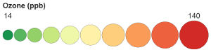
The ozone measurement is encoded using both color and size, such that a good reading is represented by a small, dark green circle, and a bad one by a large dark red circle.
Press the play button at the bottom of the map to run the animation.
The 'best' time of the day is around 5 or 6 AM, and then I think it is quite fascinating seeing the ozone levels suddenly start to grow around 9 or 10 o'clock in the morning.
The 'worst' hour is at 15:00 PM...below is a static view of what the city looks like at this time.
Best Week: 26 Sep - 02 Oct
Now let's compare this to the best week.
The difference is very clear, and even during the peak part of the day, the ozone measurments never really get into orange or red territory.
In this week the 'worst' hour is at 14:00 PM, and even here the picture of the city looks so much better.